Wednesday, February 17, 2010
Thursday, February 4, 2010
Jim's coloring book
Monday, February 1, 2010
Getting Pumped for V-day

Historically, Valentine's day and I haven't been on the best terms. The holiday seems to have an unfortunate tendency to coincide with breakups, defacing injuries, and other tragic events. I realized not too long ago that I was probably going to spend yet another Valentine's being just as single as ever, so I decided that instead of whining about it, I would make super awesome valentine's day cards and then give them out to everyone I know.


I didn't like this one, so I decided to redo it, but then I decided I liked it again.
Wednesday, January 27, 2010
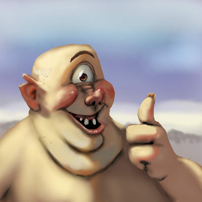
Fat and Goofy: The Secret to Artistic Happiness
For all you true believers who might be interested in learning what my process for digital painting is like, here's a quicky on one of two approaches that I usually take. This approach is remarkably similar to Adam Ford's.
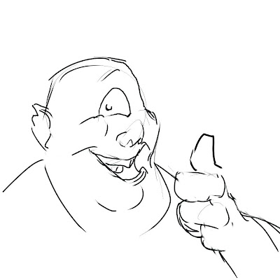
Step 1: Draw something. I'm using the fine point pen from Corel Painter 9 for this drawing, but I'm pretty sure there are other brushes better suited for sketching; I just haven't found any yet.
Step 2: Base colors. Here's where you nail down your silhouette. Keep it all one color, because if you want to change the skin color later on (which I did), all you'll have to do is experiment around with the paint bucket tool until you find the skin tone that's right for you.

Step 3: on a soft light layer, I put a desaturated green on his beard growth area, yellow across the forehead, and a rosy pink color on his cheeks, which I really wanted to play up on this one.

Step 4: on a multiply layer, I put down a light yellow color everywhere I wanted to show direct sunlight. By the time this step is over, the image should be able to read well even after you take away the lines.

Step 5: Another screen layer with a desaturated cyan midtone. After I finished this, I took the opacity of the layer down to 37% or so so that the ambient lighting wouldn't be overpowering.

Step 6: slap in some occlusion shadows on a multiply layer. For this, I painted using a straight black but set the the opacity of my brush really low, about 10%.

This is what it looks like when I put all the layers together. After this point, I flattened the image and worked out some things like soft and hard edges, subsurface scattering along the core shadows and in the ear, and then I decided that he needed freckles.


Step 1: Draw something. I'm using the fine point pen from Corel Painter 9 for this drawing, but I'm pretty sure there are other brushes better suited for sketching; I just haven't found any yet.

Step 2: Base colors. Here's where you nail down your silhouette. Keep it all one color, because if you want to change the skin color later on (which I did), all you'll have to do is experiment around with the paint bucket tool until you find the skin tone that's right for you.
Step 3: on a soft light layer, I put a desaturated green on his beard growth area, yellow across the forehead, and a rosy pink color on his cheeks, which I really wanted to play up on this one.
Step 4: on a multiply layer, I put down a light yellow color everywhere I wanted to show direct sunlight. By the time this step is over, the image should be able to read well even after you take away the lines.
Step 5: Another screen layer with a desaturated cyan midtone. After I finished this, I took the opacity of the layer down to 37% or so so that the ambient lighting wouldn't be overpowering.
Step 6: slap in some occlusion shadows on a multiply layer. For this, I painted using a straight black but set the the opacity of my brush really low, about 10%.
This is what it looks like when I put all the layers together. After this point, I flattened the image and worked out some things like soft and hard edges, subsurface scattering along the core shadows and in the ear, and then I decided that he needed freckles.
Friday, December 25, 2009
Merry Christmas, One and All
For one of my figure drawing sessions at work this month, we had Santa model for us, and I decided that it would be great to bring out my gouache paint set and make a postcard out of it
Our Santa is a pretty cool guy, the kind you would drink a beer with, If you were a beer-drinking kinda guy.
This is the staff of Cordovan School of the Arts.
Our Santa is a pretty cool guy, the kind you would drink a beer with, If you were a beer-drinking kinda guy.
This is the staff of Cordovan School of the Arts.
Friday, December 18, 2009
Shane Lewis


I've been copying Shane Lewis lately. His blog can be seen at http://stlewis.blogspot.com/
The frog on the top is my demo for a class in which I taught some five year-olds how to watercolor a Shane Lewis frog. I had a bit too much water when I was painting the eye, which resulted in a happy mistake that made lit look like a crying frog.
Subscribe to:
Posts (Atom)


